Showing posts with label Vinnie Loves Maude. Show all posts

Monday, June 27, 2016

Lesson #4 Vinnie and Maude Make a Love Connection - Let's Join Those Blocks!


I am loving the blocks I'm seeing in the QAL FB group! And not one complaint about those tiny squares we dealt with in the last lesson! Yay! Either you conquered them with some of the tips or maybe you just knew I didn't want to hear any whining. Either way, I'm happy.

No matter how many blocks you have whipped up since our last lesson, they won't do a whole lot of good just sitting around your studio, dining room table, guest room, living room, or wherever it is that you do your sewing. It's my experience that quilters tend to average about 15 UFOs at any given time and we don't need this project turning into number 16 for you. So let's get them sewn together!

The big two decisions you need to make are layout and spacer blocks (or no - because depending on your layout, maybe you don't need spacer bars!) We'll start with layout, because as many of you have pointed out already, the possibilities abound and I might as well get you all a-twitter with ideas right off the bat.

The two obvious layouts most of you are probably working with are the one shown on the cover

It's a little like bouncing balls.
or the baby sized version

 Both of these versions shown in the pattern use spacer blocks. I will never deny that I am not a fan of "blocks and sashing" style quilts, and therefore I'm always looking to set my designs in more interesting (to me) ways. Spacer bars come in handy for that kind of thing.

But that isn't to say you NEED them. In good news, I'm also a fan of blocks that form interesting (or at least some form of) secondary patterns when blocks are placed next to each other. I didn't love how my scrappy blocks looked side by side, but if your blocks are a little more planned with a more consistent background fabric, you just might love the look of them side by side in a grid:
Kind of looks like tiles to me.
Or on point - in this example I used the same blocks for the setting triangles. You'd have to slice some of your hard work to do it, but it could work. I'd probably sew it all together then square the sides off before adding the corner setting triangles. A little easier than doing more math!

It's like an explosion of Halloween
Isn't it pretty cool how on point the lines of the block almost look wavy? It amazes me that these are just turned a different way - both settings are using exactly the same blocks!

If you are doing the larger blocks, this all works the same way, and you probably got a taste for how the lines get a little wavy when you saw the layout for your quilt on page 7 of the Vinnie Loves Maude pattern. I'd love to see someone add lots more larger sized blocks and make a twin or larger! But yeah, I don't have time so why should you either right now? I'll just keep hoping!

Then of course there is the photo you've seen a million times, but I'll show it again anyway:


Deb Hartman's award winning version.
These blocks in my runner shown at right were set side by side, but because they were all so different, there is still plenty of interest in the design for me. But then there is Deb Hartman's award winning (for real! She won "Best Use of Color" in her guild's challenge!) runner, which uses all the same colors but that border fabric and added use of some appliques just ups the interest for me and makes the whole thing sing.

Don't you love talking quilt possibilities? It's almost as much fun as talking baby names.


But wait! There's more!


What if you DO want to add spacers? And why shouldn't you? Not only do they add some interest to a setting, but if you have extra fabric, why not use it up? PLUS, as you will see, there is at least one way that the spacer bars can act as a self border! 

There are two ways to look at the spacer bars - as solid bars, and as pieced bars. The pieced bars were what I chose for the cover quilt, because when I started designing this block and pattern, in my mind the background would blend well with the blocks. At first, I thought that this could likely be accomplished simply by using a single low volume fabric for all the spacer bars, and that in doing so it would totally blend right in with all the low volumes in the background of the blocks. I was oh so wrong. 

Every time I looked at my quilt on the design wall with the one-fabric spacer bars, it was like my eyes forgot how to keep moving. Dead stop at every bar. It literally killed the momentum of the quilt.

Luckily, this was easily fixed, if not quickly fixed. All it took was another dive into my low volume scrap bins, some cutting and piecing, and the background really started to enhance rather than forestall the full design. Just seeing how much more movement these spacers gave to the overall look kept me going, even as I had to piece 13 large spacer bars and 4 narrower ones. 

   
Page 4 of the pattern shows the basic pieced spacer bars in Diagrams 8a and 8b. In both cases, you can see I put the wider of the scraps in the middle of the pieced bars, but there is no reason you'd have to stick with that. As long as your spacer finishes at the right length, go crazy! Add more or less units! As I say in the cutting directions on page 2, you can even piece the individual units within the spacer bars if you think you can handle the excitement. Hopefully you can see in the above photo how I did that - look for the horizontal seams within those spacer bars and you've found them!


If you aren't in the mood for so much piecing, though, there really is nothing wrong with just using a single fabric for all of the spacer bars. I did it with a small version of the scrappy blocks, and while it is a different look, who is to say it isn't just as valid? There are no rules in my quilting world - there really shouldn't be too many in yours either!

As I was working on my own new version of the Vinnie Loves Maude for the QAL, I discovered that combining pieced and unpieced spacer bars is also a nice possibility and adds even more fun as the pieced bars, if done as I did, create a bit of a self bordering effect.


Granted this is only the top, so it doesn't look completely amazing yet, but I always like an unexpected and/or asymmetrical border. This border is sort of "incomplete," in that it doesn't border around the middle blocks in each row, but in my mind once the binding is on that will disappear a little as there will be blue all around. In my mind. We'll see how reality goes. In any case I personally really love the look of having combined some basic spacer bars in the middle of the quilt with some pieced ones on the outside. Just another option to blow your minds.


Spacer bars or not, the piecing of the top is really pretty straight forward. Combine your blocks into rows and your rows into blocks. If you aren't doing totally scrappy and you care a lot about where some of your fabrics end up in the rows, make sure to use a pin on the end of a row or the side of a block to remind you which end is up (or down, or right, or left....the key is to remember what you used that pin to tell yourself, which isn't always easy to do in my own studio, I'll be honest.)

 Now, what did that pin mean again?
One more piecing note, which applies not only to my blocks but also to the entire top construction. I'm coming out to you as an open presser. It's true. If you didn't know it, you do now. I've been pressing seams open for about three years. I started during a QAL run by Michele Foster called Aiming For Accuracy, and pressing seams open was her very first tip on being accurate.

To be honest, I thought she was slightly crazy. Seams are supposed to nest! They can't nest if they are all flatty and open on each other!


But then I gave it a try. And darned if it doesn't work.

For one thing, it's way easier to pin seams properly when you can actually see both seams and feel where they are flattened. Observe:

Obviously you wouldn't pull back the seam allowance with the pin. But see how the seams come together?

And then there is always the bit of slippage that can happen when butted seams come apart as they are being sewn. I honestly believe that is eliminated when the seams are nice and flat and don't contain ridges that can get pushed in the wrong direction, even slightly, by the presser foot.

While I don't care a ton about exacting points, I do have to say, pressing open has made a huge difference in my accuracy. It's something I recommend to just about every student to just try and see if you note a difference in your own accuracy. If not, go back to pressing to the side. Nothing ventured, nothing gained, right?


Monday, June 13, 2016

Lesson #3 - Piecing those blocks! Dinner has arrived!

Assuming you haven't decided to either drop out or hex me due to all that cutting, and in good news I haven't to my knowledge been burned by any laser beams shooting from your eyeballs directed at me nor have I woken up screaming in the night because my cutting hand felt like it was being severed, we are on to the fun part - getting Vinnie and Maude to make blocks together. It's a little risque, but we're going to do it anyway.

The first and loudest complaint suggestion testers had for me was regarding those pesky smallest squares of background fabric. Whether you've decided to go all scrappy on us like the cover quilt or your background is all the same fabric like the one I'm making along with this quiltalong, you're going to have to deal with those small squares. We are equal opportunity for frustration of small pieces around here.

If testers had had their way, I'd have rewritten the pattern to get rid of those squares. But sometimes it's amazing to be the boss, and be able to say no. As tiny as those squares are, to me they make a  difference in the look of the block, and I like it a lot better WITH them than without them.

Witness the subtle, but still there, difference in the photo below. The right side block is made as the pattern calls for, using the smaller squares. On the left, the block is made with only the larger squares. While I am only one opinion, I personally like the block on the right better. More of the print is showing, so it is more ABOUT the prints than making the background equal. And the center "star" type thing is way more pronounced and exact when the block is made as printed, rather than being somewhat cut off at the corners. But that's me. If you really really hate the little squares, try it without. Maybe you'll be okay with it.

 I will say this - once I told testers I was not budging, most agreed I was right to leave them in for interest of the block. I place the Vinnie Loves Maude block in the category of "Not Difficult, but Takes Some Time." Not all quilts can be whipped out in an afternoon. And much like the adage, of which I am a huge fan and believer, of "You Get What You Pay For," you also get in design interest of a finished quilt what you are willing to put into it. There's a time and place for quick quilts; I love that time and place and have made and designed lots of them and will continue to do so. There's also a time and place for quilts that might take a little longer; if we are honest, those are the quilts we are drawn to more frequently in show and tell and quilt shows and online. I want to design a few of those too, and this just happens to be one of them! (Insert "So there.")

So how do we mentally deal? We buckle down, we put on the fun music or a good audio book, and we chain piece our little heads off and get those suckers on there!


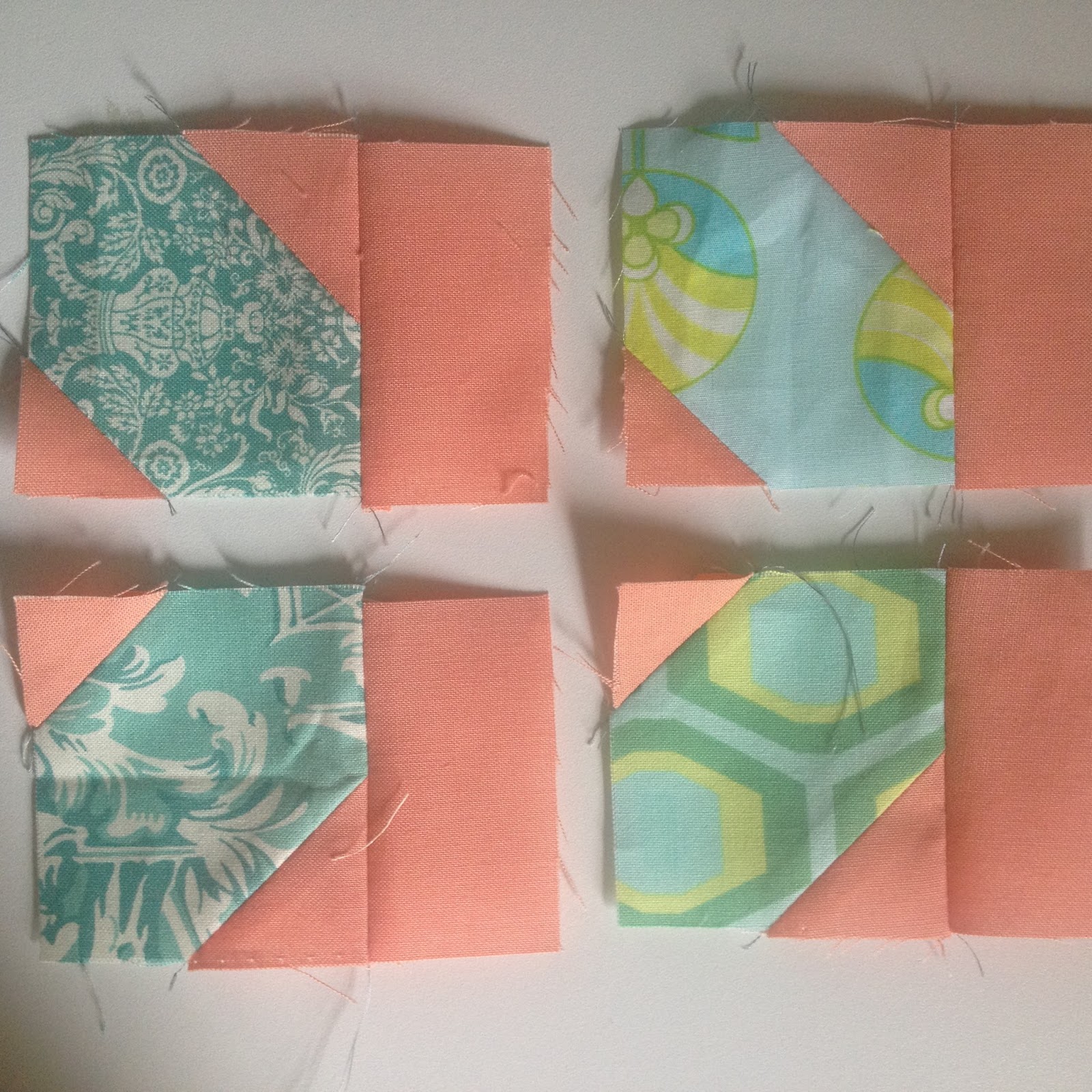
With small pieces, especially sewn at a diagonal, seems to come the risk of some machine entanglement, and let's be honest, "entanglement" may be kind of fun to say, but it is no fun to deal with. No one wants to be pulling fabric out of the bobbin case on a regular basis. One thing I have found to help when chain piecing these bits is to lift the presser foot between each piece in the chain and manually insert the needle into the next set to be sewn, as shown at left. The needle can be inserted right at the tip of the piece, but because it is indeed actually INSERTED rather than sewn onto at a rapid pace as chain piecing goes, the risk of pieces becoming messed up at the corner and/or all balled up in the machine is cut down significantly. Does lifting the presser foot and putting down the needle between each segment take a little more time? Sure. Would having to stop chain piecing to rip a seam that got entangled and messed up every three segments take longer? Trust me, it would, it does, and it has for me.

You may not find that chain piecing these small pieces is any problem at all for your machine to handle, and if so I say bully for you. I personally find the smallest squares can ball up, but the other squares, which are only a teeny bit bigger, never do. It's a mystery of the universe. And for those of you making the larger size block? You'll probably have no idea what I'm talking about, because yours will go together smooth as anything, being that much bigger.

Now, you may have noticed in these photos that I have not done the expected thing when sewing corner to corner - crazy as I am, I have NOT drawn a line on the background pieces. I haven't even made mention of doing so anywhere in the pattern. Is this because I am a rebel? Is this because I am lazy? Is this because I have discovered the best tool in the world that eliminates the need entirely? YES TO ALL, HOTTIES!

The tool in question is the Clearly Perfect Angles tool from New Leaf Stitches. It's basically a clingy plastic sheet that adheres to your machine and, as long as you follow the easy directions given on how to put in on your machine, your needle is lined up perfectly to sew either a perfect diagonal, as in the Vinnie Loves Maude blocks or any flying goose you'll ever make, or a perfect 1/4" seam, as you'll need in any block ever, or even piecing at a true diagonal, as you'll do if you ever make my Yankee Frugal quilt pattern and many others I did not invent.

As shown in the photo at right, just keep the tip of your background piece in line with the middle of the black and green lines on the CPA, and you will make a perfect diagonal every time. It really is that simple. Sometimes, if you listen very closely, you can even hear the angels singing.

As an added bonus, the plastic creates a smooth surface on the machine that seems to prevent some of the balling up and entanglement issues. Why? My theory is that it keeps the fabric moving smoothly, and therefore it doesn't have time to get tangled, even on those pointy little edges. But what do I know? I'm no scientist. All I can tell you is it seems to make a difference.

In the pattern and on the cover, the background pieces are all different low volume fabrics rather than one fabric for all of the background. I personally think that though it is more of a pain to cut all those pieces, the end result of the block is SO much more interesting with all those different fabrics, and it's really what gives the block the "vintage-y" look that lent it its name. But all that is really neither here nor there at this point since you have already done all your cutting. My point in bringing it up at all is that if you are using all different fabrics in the background, there's so much going on in this quilt that no one will notice if one or two of the same one touch, so put them on without spending a whole lot of time overthinking.

Okay, so moving on...you've gotten all your little background squares sewn to your prints, which as you will see on page 3 we now call Unit A. Whether you do this in sets of 16 prints, so you do enough for one block at a time, or you do all the print squares for your entire quilt at once, is totally up to you. I like to do one block worth at a time to break it up. Either way, at this point, grab 16 of your Unit As. Admire how awesome they are.

Now, maybe you care and maybe you don't about this next process, which is to plan a little bit about where to place the fabrics within each block. I cared in the quilt I am currently making but I didn't in the cover quilt, and the reason was that in this current quilt my fabrics tend to be a little more similar, and I didn't want prints that look too much the same too close to each other in the block. Also, to be honest, I didn't make any of the cover quilt blocks, so I REALLY had no need to care about those. So here's how I rectified that. If your prints are more scrappy, you can probably just piece the blocks without worrying too much about placement.

1. Choose four fabrics for your corners, Units B and C on page 3. I choose two sets of fabrics that are quite similar to each other - a set of teal with yellow, and a set of teal with white

2. Make one Unit B and one Unit C from each of the fabric sets chosen. Alternatively, you can make your two Unit Bs from one fabric set and the two Unit Cs from the other fabric set. Either way you make sure you have these sets ready to be placed in opposite corners of the block.

NOTE: Did you read step 2 on page 3? That reminder to watch placement of corner triangles is worth tattooing to your hand. Or embroidering to hang above your machine. Or something. Without doing it right, your block will not look like mine and you will be sad. I don't want you sad.


3. For the rest of the block units, you will need four Unit As for the center, which I like to choose kind of the same way as for the corners, that is two sets of similar prints, and then the rest in pairs for the sides. This is a little different from the order I have in the pattern on pages 3 and 4. What did I say, I'm a rebel.
4. Once the final background pieces are added I always arrange my units and play with them a bit until I get it right. But having those Units B and C in opposite corners really helps me lay it out so that my fabrics aren't too blendy.
Then all that is left is the big old sew the rows together and make that block sing part. I don't pin anything as I sew unit to unit, but once I have three rows, I do pin at the intersections. The way the units come together it isn't crucial to line much up, but the rows do have some intersections you might care about. Or not. I'm not picky, as you know. If you are, pin more. If you aren't, don't.

Finally, another thing to consider, something I did when making my blocks, is changing up the construction of Unit E in some of your blocks. I am making the baby size quilt, and decided to do four Unit Es as shown on page 4, but then mix it up and do five with the larger triangles to the middle. Look how Unit E goes from roundy to squarey with just that simple change! But the block still looks cool, and the "starry" sort of center created with the background fabrics remains.

Slow and steady wins the race on the piecing for this one. I'm giving us all two weeks until the next tutorial comes out June 28, which will be all about the spacer bars. I know it's only like a third of a page in the pattern, but I've got some stuff to say about them you just might want to hear. 

Remember to post your progress on the Vinnie Loves Maude QAL group. I love seeing what you are all doing!


Monday, June 6, 2016

Vinnie Loves Maude QAL Lesson #2, Cutting Tips - or Arriving at the Restaurant

The fabrics have been contemplated, assessed, reassessed, fondled, maybe rolled around in, whatever. We don't judge around here. (Oh who are we kidding? We judge. Just not about fabric lust.) As long as they are chosen and all piled up cute on your cutting table, you are ready to move on to the second part of the big blind date event - cutting all those pieces.

Yep. You've maybe looked at your pattern and seen three-figured numbers of how many of each whatever to cut, and it's entirely possible that you may have died just a little inside. Allow this post to serve as virtual CPR if necessary. I can't have my peeps keeling over on me before we've even set rotary blade to fabric!

My first tip for cutting may seem obvious, but I never assume anyone knows everything in my head (that would be scary for you, believe me). So here it is - Frequent Breaks, Augmented by Cocktail Hour. Seriously. To cut XXX squares of prints all in one sitting means you need a sitting. And most of us not only cut standing up, but have lives. So cut a few, then throw in a load of laundry. Cut a few more, go pick up a kid at some kid activity. Cut some more and reward yourself with an episode of Outlander. (Warning: some people cut in front of the TV, which is also a great tip, but I don't recommend it with Outlander due to possibly missing a Jamie shirtless moment.) Cut a bunch of lime fabrics then a bunch of limes for gin and tonics. You get it. Stagger the cutting and it won't make you want to strangle me quite so much. I like breathing, so I appreciate it.
This is about half of my prints. Then it was time for something a little less mind numbing.
 A tool I find invaluable for cutting squares en masse from strips is the Shape Cut. I've had mine forever and honestly it's one of those tools that I don't use frequently as I don't use strips frequently, but when I do use it, it is almost like I can hear angels singing. Especially if you've chosen a single fabric background for your quilt, I highly recommend giving it a whirl and at least all of those pieces will be cut really quickly.

Video from youtube. It isn't me, in case the fabric didn't give that away.


So that's all well and good. But what if you are NOT cutting from strips, as may well be the case the scrappier you are going with your palette? And especially if your scraps, like mine, are all sorts of shapes and sizes?

Actually the shape cut still works pretty well. Sure there will be some waste when you start off with odd shaped pieces, but it still cuts down on some of the measuring and moving around of rulers.

This video is actually me. God help us all, but here we go.


Finally, as far as making the cutting go faster, my final tip is using some precuts for the prints, even though as most of you know I'm not a huge fan of "line-y" quilts, ie quilts made from a single fabric line. However the ease of cutting the prints from jelly rolls, charm squares, or layer cakes may make up for it for you as you slice and dice your way to piles of squares. Make the quilt less "Granimal-ly" (another of my fun made up adjectives, harkening back to the matchy matchy Granimal children's clothing line of the 1970s) by adding other fabrics to the mix that share the same colors, but are decidedly different in tone or value or scale or all three, and you've "Scrap Slapped" it like I always love.

Yardage to the left of me, precuts to the right...here I am, stuck in cutting hell with you.

Another thing to consider when cutting the prints for this project is scale. With smaller and medium scaled fabrics, you shouldn't have to think too hard to get a nice looking square cut that makes sense, but those larger scale prints might be a little more complicated. Just cutting in strips you risk losing some of the fun of the print.

 My advice is to go ahead and fussy cut. Find some motifs that look great centered or slightly off centered or whatever and cut a few holes in your yardage. Don't worry about waste if you love the fabric. As my husband says of just about anything, and it definitely applies to fabric "They make more." And even more importantly, as designer Amy Friend says of fussy cutting, "If the fabric does what you want it to in the design, nothing has been wasted." She is a wise woman.
I personally just use my clear square rulers to fussy cut. It's close enough to fussy for me. Some people prefer to make a "window" dealie out of cardstock or some other heavy paper lying around the house and use it to audition motif areas. Either way. It's a great technique for cutting down large scales into something pretty and both workable and eye-catching in this pattern.

I hope a few of these little tricks and tips may help you in the cutting process. I know it's involved, and honestly there isn't much I can do to help you other than to make sure you know I'm over here, cheering you on as your piles of cut fabrics get bigger! Finally, remember, I never required you to make the lap/twin version when you signed on to the QAL, so if you are feeling overwhelmed, make a goal of enough blocks for a table runner at first. If you feel like you can keep going, add four more and you've got the baby sized version. Then go on from there. I really do find breaking up the cutting and sewing does wonders for my attitude! Maybe it will for you too!

I'll see you back on June 14 when we fire up those machines and get going with the piecing!


Tuesday, May 31, 2016

Vinnie Loves Maude QAL Lesson #1 - Fabric Selection, or Dressing for the First Date

Can't you just see Maude, getting ready for her first date with Vinnie, staring into her closet and sighing heavily: "But I have NOTHING TO WEAR." Well, I'm not sure how to help her out, but as far as helping you pick out your fabrics for the spectacular quilt you are about to make, that I can do.

Now that you have the pattern, the first exciting step is to audition fabrics. (Don't have the pattern? Click here!) One of my favorite things about any quilt design is how its look can change so much just by changing a fabric. Or two. Or all of it. While it took me several years of being a quilter to be brave enough to step out of the color choices of the designers whose patterns I was using, once I took the leap I never looked back. Color and fabric choice is the quickest and easiest way to put YOUR stamp on and your personality into another designer's pattern. So don't be afraid to color your quilt with your own crayon box, ie your stash.


But if you are still looking for color and fabric inspiration, allow this tutorial to kick start your fabric pull fun.

Option #1 - Modern prints with low volume backgrounds, just like "The Cover Quilt."


A mish mash of as many different low volume prints as I could get into one quilt was really the inspiration for this pattern, believe it or not, and the rest just kind of grew from there. I used modern prints for the foreground and envisioned that the end product would look very modern indeed. Imagine my shock when I had the whole thing together and it looked like something my great grandma might have made if she hadn't been so busy not being a quilter.

Also imagine my joy to find this awesome quote from the Craftsy blog, proving I wasn't losing my mind to think new looked old: "The trend to use low-volume fabrics in quilting is actually a very classic idea. Many antique and vintage quilts feature low-volume prints as background fabrics simply because solid fabrics were a bit harder to come by. If an early quilter didn’t have solid fabric yardage, she most certainly had leftovers of light prints and calicoes that could be used as background fabrics."

Well. There you go. And the name Vinnie Loves Maude, derived from "Vintage" and "Modern" was born. Plus we've just learned that when pluralizing "calico," apparently we add an "e." Step back, Dan Quayle.

In this close up photo, you can really see how all the low volume backgrounds blend, yet create a distinct patchwork background for the really cool modern prints used by all of my testers, showing them off without overpowering them.

So what exactly is a "Low Volume" print?

Much like what exactly is a 1/4" seam allowance, every quilter probably has a different interpretation of the real answer, but here's the basic jist with a splash of my own opinion thrown in:

Low Volume - "a very light colored fabric, preferably cream, beige, eggshell, ecru, spoiled milk, buttercream with a hint of vanilla, grey, or on a crazy day a very light pastel, that reads light, yet contains a subtle print." Refer again to the photo at right - see how the background fabrics all have a little something-something going on? No solids among them to make your eye stop and ruin the flow.

Good LV choices

Here's a dirty little secret - three of these LV fabrics are actually the BACK SIDE! If your LV is still a bit obvious in the block, just flip it over and use the back. That tip alone just paid for this whole QAL, didn't it?

Not so good LV choices - too much color or obvious pattern.

Now, those who took part in my test and group quilt know that there was quite a debate about not only what is low volume, but also what is modern when it comes to a "modern" print. And that, my hotties, is the million dollar question. What I was looking for comes down to this basic definition I'm pulling out of my own head, meaning your opinion may vary:

Modern prints - "Bold colors and medium to large scale prints, often but not always geometric in nature, and purchased at a quilt shop no earlier than 2011." As with many things, I find it easier to say what isn't a modern print, and what isn't are tone on tones, batiks, primitive or Civil War fabrics, small scale prints or ditsy prints, and 30s types of fabrics. This is not to say I don't love those fabrics (well, let's be honest, I don't love two of those categories, but they will remain nameless), it's just to say that they aren't, in my mind, "modern." But maybe they are in yours. Maybe you want to try low volume background with some of your own brand of modern. Who am I to stop you? It's your quilt! I say do it! You love the fabric, you use it. Plain and simple.

I'd call these modern

I would not call these modern,

Option #2 - Reverse/Inside Out

However you care to say it, I'd describe this option as the reverse of the first option, with the prints (darks) being the background and the low volume or lights being the foreground. I loved the one block I received from testers that had reversed the values and it now lives in the middle of the table runner sample. 


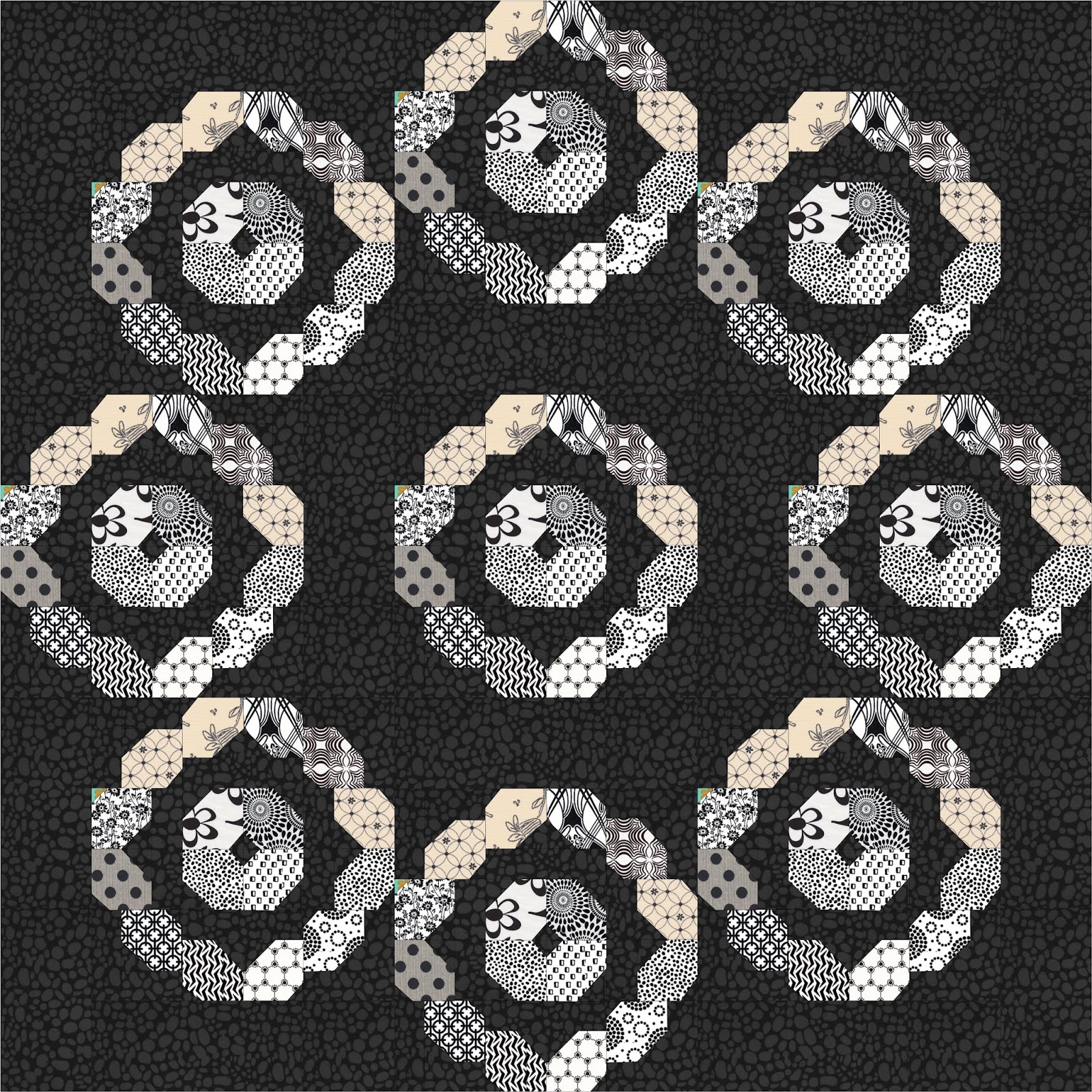
I whipped out the handy dandy EQ to see what a whole quilt might look like with this color scheme.
 Kinda vintage lacy, no? But maybe you need a little pop of color or nine?

Okay then.
Look how using the same background fabric makes that funky 8 pointed star secondary pattern pop out.

Love that.

Now throw in more of a scrappy background with lots of different black prints:

Isn't that cool? A scrappier look, but still the same feel. I love and adore EQ.

This may be my favorite option, so I feel like I should say more. But there is no more to say. dark background, lighter prints. Done.

Option #3 -Pop Those Colors!


People who know me know I'm all about the grey as a neutral these days. Mainly because grey IS a neutral, and one that often really can pop colors way more than white or cream ever can.

This example of a colorway is all about a little pop of yellow in a sea of three different shades of grey. Not 50. That would be too titilating. Less is more. To accomplish this look, just choose a couple of fabrics for your prints rather than lots of scraps, and sub in a few background squares of your "popper" color in the center background of the blocks. A great new look if you don't feel like digging through all your scraps!

Too much grey for you even to get the idea? How is this for you? Cut it down to three fabrics with a darker background and you get a pretty, lacy effect with a little bit of pop of that yellow. Reminds me of how some brides are throwing on a pop of color with a bright belt over their dress these days.


Looking for a little more drama using just a few fabrics? How's this? Choose those few fabrics plus a background, bring the popper (this time green) out a little further by including those inner rectangles in the pop, and you've got a pretty cool little design that your LQS is thrilled to have provided some chunks of fabric for!


Now, as you may note in the pattern, the five block runner is not shown, only suggested on page 7 - and if you haven't seen Deb Hartman's orange runner that was the inspiration, make sure you look in the FB group! It's a stunner! As far as fabric requirements for a five block runner in color ways like I've shown here, half a yard of each fabric you plan to use should be more than enough, with scraps left over for your next Vinnie project!

The block at the left was made by one of my testers, and is sort of a combination of all of these popper type blocks. It only proves the possibilities are really and truly endless!


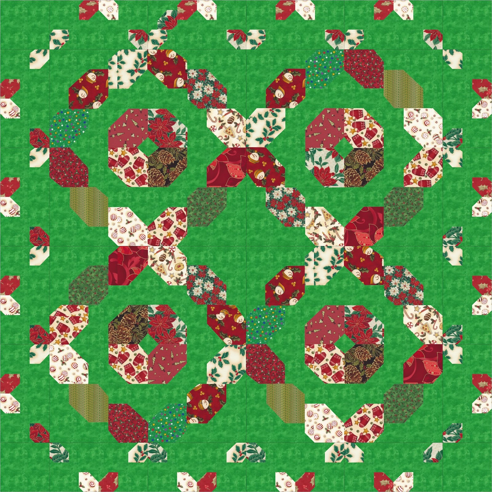
Option Four - Holiday!.....Celebrate!

You'll note the pattern actually has two block sizes, and I had some fun recoloring the larger blocks size quilt into some festive holiday themes. Obviously, either block size could be done with holiday or other novelty type fabrics. They are just kind of fun!


Option #5 - Solid background with modern fabrics, or What I'm Doing

You've no doubt seen some of my blocks by now if you've been on the FB group or my business page. Or if you've looked at the blog button, which is just a photo of one of my blocks with some words on it.


So basically I decided to make another baby sized version with small blocks, using teal modern fabrics as my prints and a solid coral for the background. Isn't it amazing how much more "modern" the design looks with all one fabric in the background as compared to the cover quilt?

I'm still working on a few more blocks - this is a QAL after all, so I'm playing along too - but through the magic of EQ I can show you my color scheme:

I'm already thinking ahead to quilting thread colors!


So there you have it - five different options for your own color scheme, but obviously those are only the beginning. Whatever fabrics you choose, just be sure they are some you love! Nothing in the world is worse than working on a quilt you can't stand, am I right?
Next Tutorial all about cutting tips will be up on June 7! Thanks for playing along!


Tuesday, March 22, 2016

Vinnie Loves Maude

TWICE IN A WEEK, HOTTIES! That's how often I've released a new pattern over the last few days. Can you deal with it? I, queen of taking forever and a day to get a pattern to completion, CANNOT!

Vinnie Loves Maude
If we are being honest, this latest is actually not QUITE ready for the printer as of this very moment, as I'm waiting on the all important cover photo editing (as you can see, it's a little washed out looking over there, and that will never do in print), but it's good enough for a $5 intro price PDF download on Craftsy. Let's face it, I could not wait any longer to share the joy of this latest group project pattern, because, as always, I do love it oh so very much and I hope you will too!

As with any of my group projects, this one started with a pile of scraps, a couple of cups of tea, and a dream. To be honest, the dream went through many permutations along the way, from "The Dream of Spending an Hour in the Studio Where No One Can Bother Me," to "The Dream of Coming Up With the Next Big Thing in Quilting" to settling for "The Dream of Coming Up With Something, Anything, I Can See Has an Iota of Potential." The design process is not all sunshine and roses, people.

Eventually, my penchant for round-ish patterned blocks and I settled upon this scrappy little number. And by little, I do mean the block is pretty small. 10" to be exact. Smaller than I might I normally design? Maybe. But as we all know, I refuse to be put in a box in my design world, so figured what the heck. Off to testers/swap participants it went, with instructions to use modern prints and low volume backgrounds.

Then I did something new - actually, two new things; for the first time in the seven year history of my January group quilt project, I gave the process a name - January Jumpstart, and created a secret Facebook page called "EvaPaige Quilt Designs January Jumpstart," where my testers could gather and share pictures and ideas on what is modern and what is not, debate for hours on end about "low volume" and what on earth was I talking about, and chat amongst themselves about my awesomeness or lack thereof. The beauty was we could share photos and progress and news without anyone else seeing it as the secret group was secret. Go ahead. Try to find it. You won't. It's very stealthy of me, no? Definitely a good idea on my part and I'll do it again next year! Now and then I'm a smarty.


Baby quilt using larger blocks.
One reason I run one pattern test a year this way, allowing more opinions in than a designer probably should for their own sanity, is I actually do really like to have a gut check every year to make sure I'm on track with what the quilting public is interested in making, and a larger cross section of quilters than two or three is the only way to do that. And often the bell curve being bigger leads to stuff I would not have thought of on my own; in the case of this pattern, two changes were made, one being a technical writing thing that is boring and I won't go into but was included in the final pattern, and the other being the need for two block sizes, as testers liked the 10" one, but wanted bigger too. So the final pattern has two block sizes and three layouts - and of course who is to stop you there! Make all sorts of layouts with the block and share them with me. I'd love to see!

 
I had pictured this quilt would end up looking very modern,  given the modern fabrics I was requiring. To my great surprise, the amazing setting I fell into had a rather unexpectedly vintage vibe, and lead to the name Vinnie (vintage) Loves Maude (modern). I added the tagline "Vintage style and Mod fabrics in a classic romance" just in case my fancy little word play wasn't abundantly clear to those quilters who don't live inside my brain. Be happy you don't.


Another by product of group quilt projects can be that much as if you get 43 quilters in a room you'll see 5739 different interpretations of a 1/4" seam, pulling these 43 quilters into a project led to a few blocks just not wanting to blend with the others for whatever reason. Let me be clear - this was not a problem, and no fault of anyone, and there was no love lost between myself and testers. Different stashes and different mindsets of modern can lead to blocks with different vibes...and that can lead to another quilt entirely. And so it did! I love this adorable little scrappy number made with nine blocks and so far everyone I have shown it to does as well. There really are no mistakes, just more design opportunities!

The round blocks in a round setting - I've died and gone to quilt setting heaven.
I won't lie, there are some small pieces involved in the smaller sized blocks, but using a tool like Clearly Perfect Angles by New Leaf Stitches makes things go smoothly. I didn't design this block with CPA in mind, but I will say I have used the tool for months, I love it beyond reason, and because I love it it is something I sell on my website and in person. A couple of testers decided to give it a go with this pattern and they were amazed by the ease! I will be offering a deal on my site for this pattern plus Clearly Perfect Angles for $18, just because I believe in it for use with this pattern oh so much - but once you own the CPA, you'll be sending air kisses my way constantly because it will make your life so happy with every project you are working on.

I hope you'll give Vinnie Loves Maude a try.

The intro price will last until Friday, March 25. Thank you as always for supporting small business and quilt designers everywhere; without you, we wouldn't be inspired to keep going!
Related Posts Plugin for WordPress, Blogger...