
Now that you have the pattern, the first exciting step is to audition fabrics. (Don't have the pattern? Click here!) One of my favorite things about any quilt design is how its look can change so much just by changing a fabric. Or two. Or all of it. While it took me several years of being a quilter to be brave enough to step out of the color choices of the designers whose patterns I was using, once I took the leap I never looked back. Color and fabric choice is the quickest and easiest way to put YOUR stamp on and your personality into another designer's pattern. So don't be afraid to color your quilt with your own crayon box, ie your stash.
But if you are still looking for color and fabric inspiration, allow this tutorial to kick start your fabric pull fun.
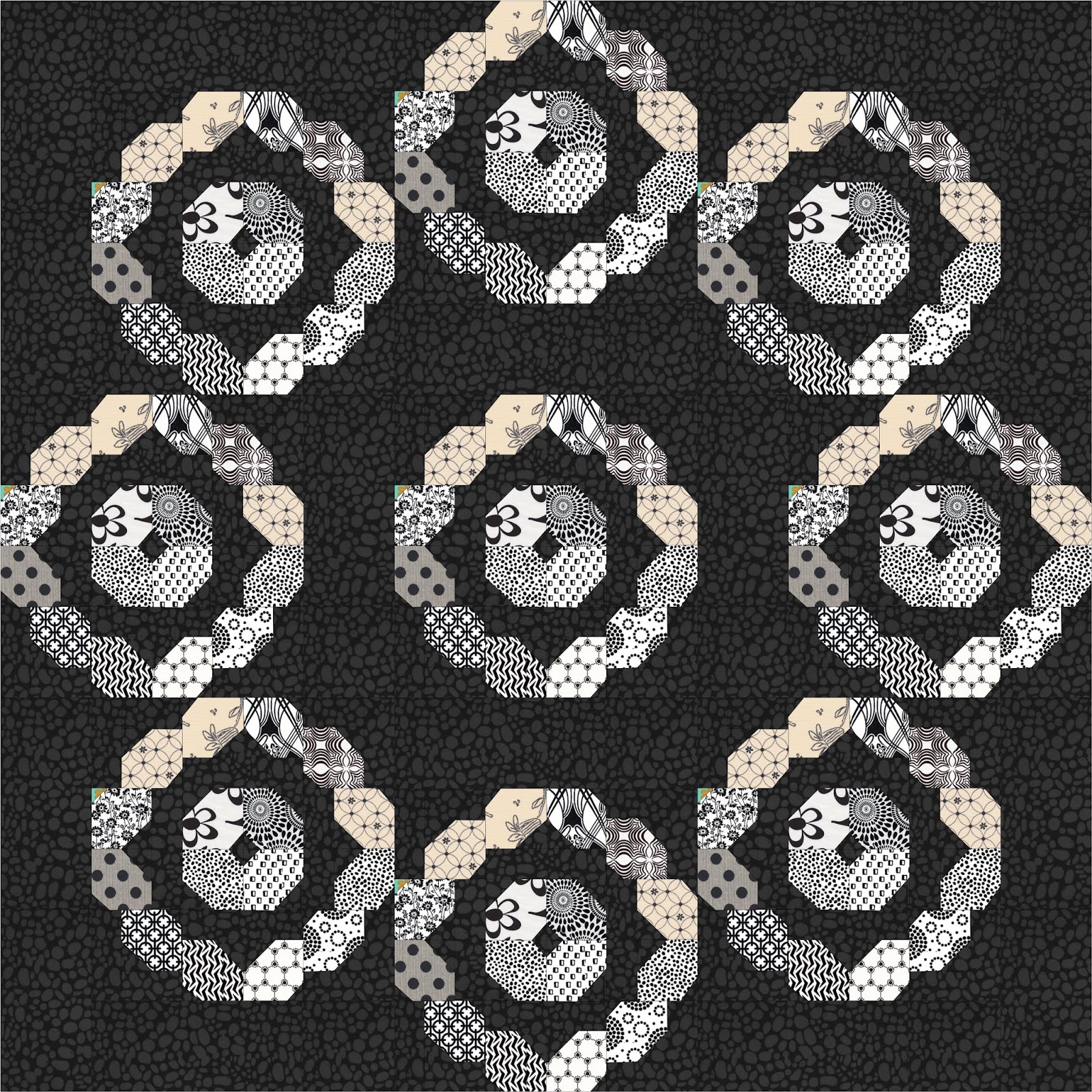
Option #1 - Modern prints with low volume backgrounds, just like "The Cover Quilt."

A mish mash of as many different low volume prints as I could get into one quilt was really the inspiration for this pattern, believe it or not, and the rest just kind of grew from there. I used modern prints for the foreground and envisioned that the end product would look very modern indeed. Imagine my shock when I had the whole thing together and it looked like something my great grandma might have made if she hadn't been so busy not being a quilter.
Also imagine my joy to find this awesome quote from the Craftsy blog, proving I wasn't losing my mind to think new looked old: "The trend to use low-volume fabrics in quilting is actually a very classic idea. Many antique and vintage quilts feature low-volume prints as background fabrics simply because solid fabrics were a bit harder to come by. If an early quilter didn’t have solid fabric yardage, she most certainly had leftovers of light prints and calicoes that could be used as background fabrics."
Well. There you go. And the name Vinnie Loves Maude, derived from "Vintage" and "Modern" was born. Plus we've just learned that when pluralizing "calico," apparently we add an "e." Step back, Dan Quayle.
 In this close up photo, you can really see how all the low volume backgrounds blend, yet create a distinct patchwork background for the really cool modern prints used by all of my testers, showing them off without overpowering them.
So what exactly is a "Low Volume" print?
Much like what exactly is a 1/4" seam allowance, every quilter probably has a different interpretation of the real answer, but here's the basic jist with a splash of my own opinion thrown in:
Low Volume - "a very light colored fabric, preferably cream, beige, eggshell, ecru, spoiled milk, buttercream with a hint of vanilla, grey, or on a crazy day a very light pastel, that reads light, yet contains a subtle print." Refer again to the photo at right - see how the background fabrics all have a little something-something going on? No solids among them to make your eye stop and ruin the flow.
 |
| Good LV choices |
Here's a dirty little secret - three of these LV fabrics are actually the BACK SIDE! If your LV is still a bit obvious in the block, just flip it over and use the back. That tip alone just paid for this whole QAL, didn't it?
 |
| Not so good LV choices - too much color or obvious pattern. |
Now, those who took part in my test and group quilt know that there was quite a debate about not only what is low volume, but also what is modern when it comes to a "modern" print. And that, my hotties, is the million dollar question. What I was looking for comes down to this basic definition I'm pulling out of my own head, meaning your opinion may vary:
Modern prints - "Bold colors and medium to large scale prints, often but not always geometric in nature, and purchased at a quilt shop no earlier than 2011." As with many things, I find it easier to say what isn't a modern print, and what isn't are tone on tones, batiks, primitive or Civil War fabrics, small scale prints or ditsy prints, and 30s types of fabrics. This is not to say I don't love those fabrics (well, let's be honest, I don't love two of those categories, but they will remain nameless), it's just to say that they aren't, in my mind, "modern." But maybe they are in yours. Maybe you want to try low volume background with some of your own brand of modern. Who am I to stop you? It's your quilt! I say do it! You love the fabric, you use it. Plain and simple.
 |
| I'd call these modern |
 |
| I would not call these modern, |
Option #2 - Reverse/Inside Out
However you care to say it, I'd describe this option as the reverse of the first option, with the prints (darks) being the background and the low volume or lights being the foreground. I loved the one block I received from testers that had reversed the values and it now lives in the middle of the table runner sample.

I whipped out the handy dandy EQ to see what a whole quilt might look like with this color scheme.
Okay then.
 |
| Look how using the same background fabric makes that funky 8 pointed star secondary pattern pop out. |
Love that.
Now throw in more of a scrappy background with lots of different black prints:

This may be my favorite option, so I feel like I should say more. But there is no more to say. dark background, lighter prints. Done.
Option #3 -Pop Those Colors!

This example of a colorway is all about a little pop of yellow in a sea of three different shades of grey. Not 50. That would be too titilating. Less is more. To accomplish this look, just choose a couple of fabrics for your prints rather than lots of scraps, and sub in a few background squares of your "popper" color in the center background of the blocks. A great new look if you don't feel like digging through all your scraps!
Too much grey for you even to get the idea? How is this for you? Cut it down to three fabrics with a darker background and you get a pretty, lacy effect with a little bit of pop of that yellow. Reminds me of how some brides are throwing on a pop of color with a bright belt over their dress these days.

Looking for a little more drama using just a few fabrics? How's this? Choose those few fabrics plus a background, bring the popper (this time green) out a little further by including those inner rectangles in the pop, and you've got a pretty cool little design that your LQS is thrilled to have provided some chunks of fabric for!


Now, as you may note in the pattern, the five block runner is not shown, only suggested on page 7 - and if you haven't seen Deb Hartman's orange runner that was the inspiration, make sure you look in the FB group! It's a stunner! As far as fabric requirements for a five block runner in color ways like I've shown here, half a yard of each fabric you plan to use should be more than enough, with scraps left over for your next Vinnie project!
The block at the left was made by one of my testers, and is sort of a combination of all of these popper type blocks. It only proves the possibilities are really and truly endless!
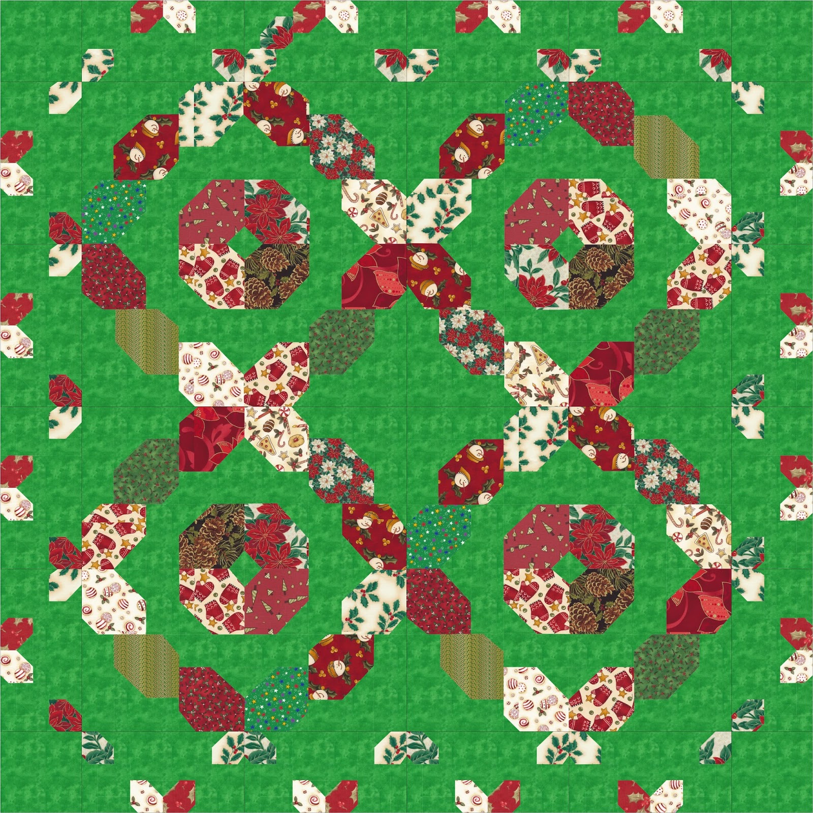
Option Four - Holiday!.....Celebrate!
You'll note the pattern actually has two block sizes, and I had some fun recoloring the larger blocks size quilt into some festive holiday themes. Obviously, either block size could be done with holiday or other novelty type fabrics. They are just kind of fun!

Option #5 - Solid background with modern fabrics, or What I'm Doing
You've no doubt seen some of my blocks by now if you've been on the FB group or my business page. Or if you've looked at the blog button, which is just a photo of one of my blocks with some words on it.


I'm still working on a few more blocks - this is a QAL after all, so I'm playing along too - but through the magic of EQ I can show you my color scheme:

So there you have it - five different options for your own color scheme, but obviously those are only the beginning. Whatever fabrics you choose, just be sure they are some you love! Nothing in the world is worse than working on a quilt you can't stand, am I right?
Next Tutorial all about cutting tips will be up on June 7! Thanks for playing along!
6 comments:
Great tutorial on fabric choices and how they affect the overall pattern, even if you're not doing the quilt along!
Beth, thank you for all the great information! My mind is now whirling with possibilities. This tutorial is so much more than I expected. Thanks again from one of your block testers.
I can't lay this time because I'm too far behind on too many other QALs and mystery projects, but I'll be following along to see the process and enjoy your wit and humor.
That's play along, of course.
I love the solid backgrounds with the modern pieces. I really can't wait to begin.
I have been thinking about your blog post all day, it has really made the wheels in my head turn. As a new piecer I still feel like I have no clue about fabric selection. But the more combinations and prints I try the more I learn. Still trying to decide what I'll pick for this pattern, but I got a few bundles in the mail today that might just work!!!! I am so grateful for the learning opportunity you are creating for us, so much fun <3
Post a Comment